Project 03 · Case study
MKB Digiwerkplaats
Website Redesign
From research to delivery, I upgraded MKB's website to be competitive, modern and on-brand.
Overview
I conducted user research to create and validate personas, and as project manager, delivered a client-approved design on time.
Four months of research with a team of 2, then two months of design with a team of 3.
Impact
- Improved credibility
- Updated CMS
- Clear brand value
Problem
The old website left users confused: unclear messaging, missing hierarchy, and navigation that often led people astray. It wasn't properly communicating MKB's value, and the CMS was outdated.
Solution
I redesigned the website with a clear value proposition, intuitive navigation, and refreshed branding to communicate MKB Digiwerkplaats's purpose effectively and make backend content management effortless.
Final design
We ended up with a design that has:
- effective communication about what MKB does
- a fresh, modern and youthful feeling, with the addition of colours and scribbles
- improved photography
- more clarity in navigation
- and more...
User research
I first set out to understand the business and user needs. Through desk research, interviews, and a creative session with entrepreneurs, we gathered insights that guided the new design direction.
What does MKB Digiwerkplaats do?
"Together with talented students, we strengthen your business. At MKB Digiwerkplaats, you receive free support from students for your digital needs."
And since it is aimed at small and medium sized entrepreneurs, we talked to them in 5 semi-structured user interviews.
Interviews: main insights
- "I'm looking for networking opportunities in events and connecting with the students"
- "I like the students for their youthfulness in perspective, ideas, methods of working etc."
- "I want clarity in what MKB does, and have my expectations met."
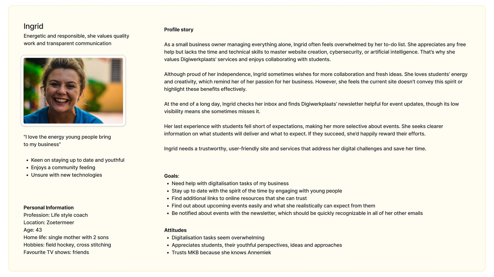
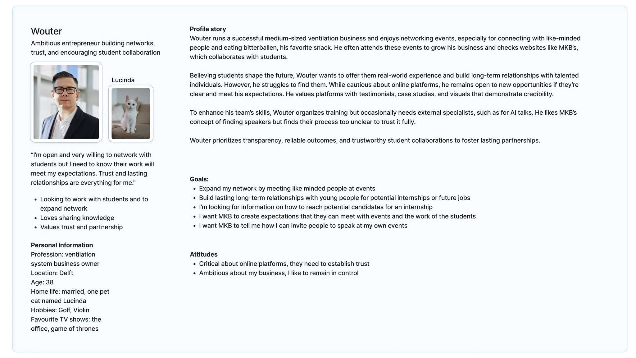
Personas: meet Ingrid and Wouter
I did a deep dive into personas with NNG and the book The User Is Always Right: A Practical Guide to Creating and Using Personas for the Web by Steve Mulder and Ziv Yaar.
Research conclusion
Our research showed that MKB Digiwerkplaats can strengthen its online presence by focusing on four key areas.
- Showcasing student perspectives, highlighting their fresh insights and unique value.
- Emphasising networking opportunities, positioning MKB as a hub where entrepreneurs connect, learn, and grow together.
- Improving navigation and clarity, ensuring the website is intuitive, concise, and easy to use.
- Communicating clearly and managing expectations, so entrepreneurs understand exactly what MKB offers and feel confident reaching out.
These insights served as the guidelines for the design phase and helped MKB build a website that truly reflects their brand and meets the needs of entrepreneurs.
The in-sitemap
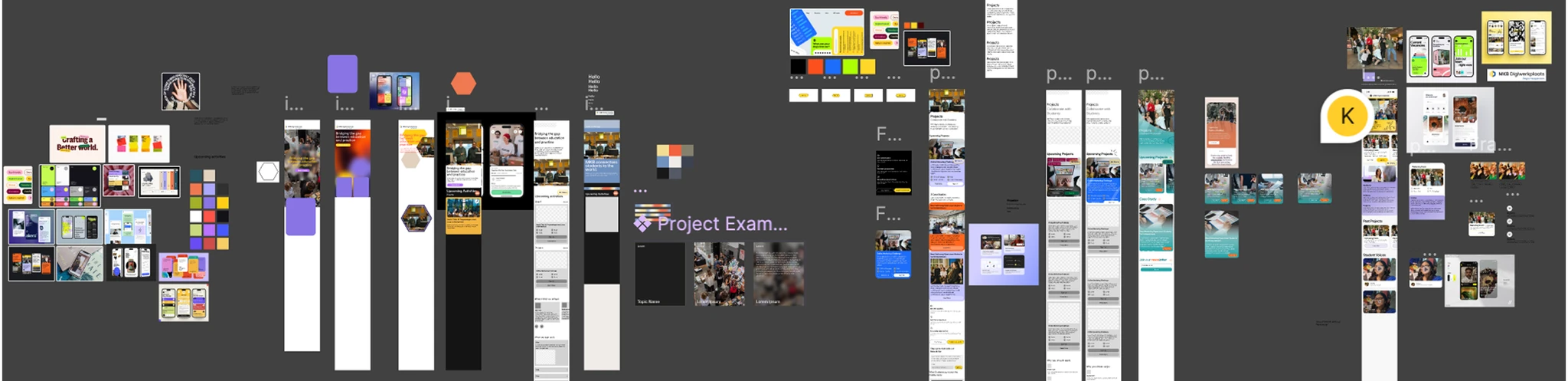
We compiled all of it into an in-sitemap: the research organised page by page, so every finding sat next to the screen that would have to carry it. That board is what we designed against.
Design in Figma
For the design phase, our team of 2 increased to 3 with the addition of an intern. This pushed me into a project manager role, a challenging and valuable experience.
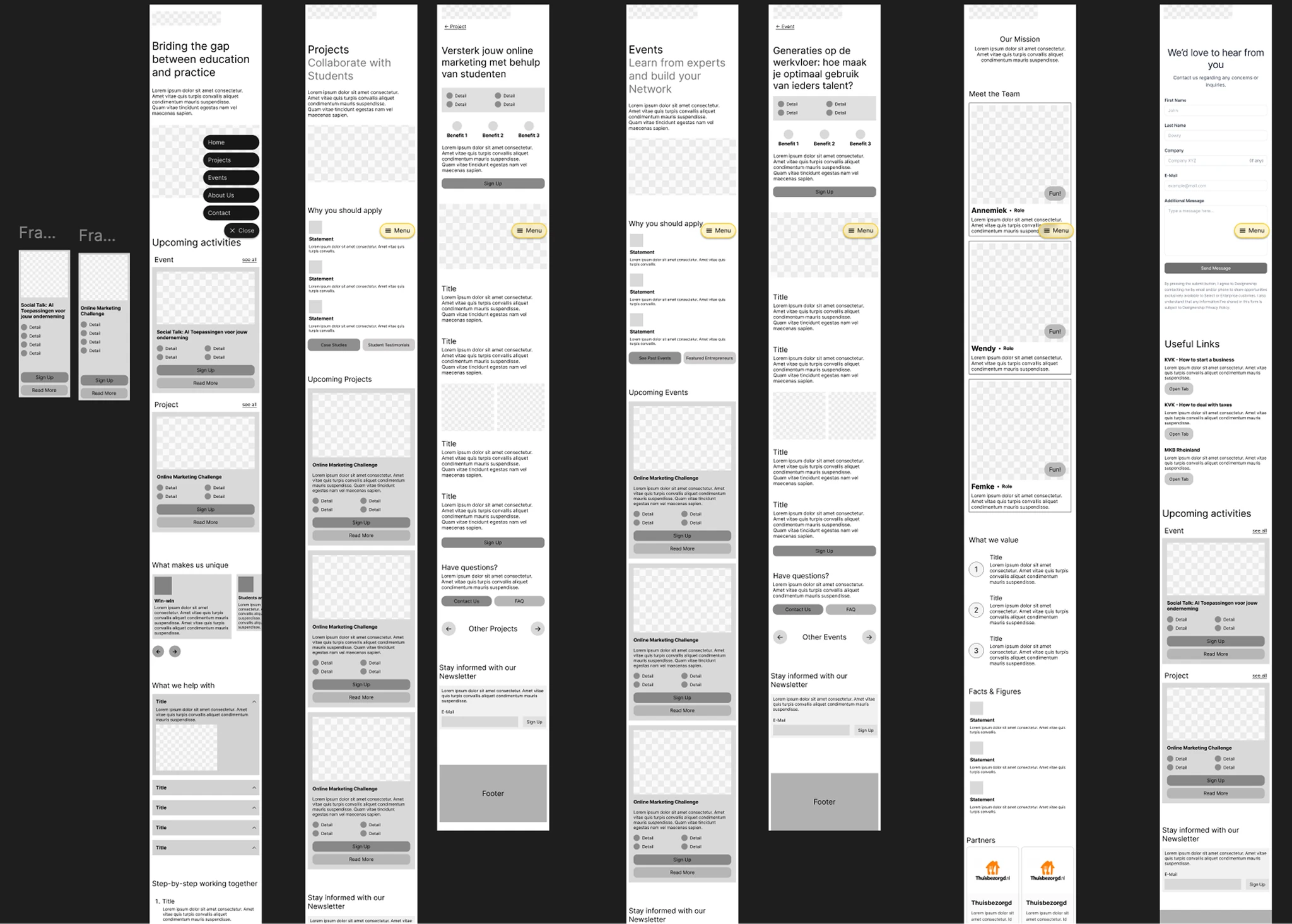
Lo-fi wireframes
We decided on a mobile-first approach, since most of our users would start there. And this would serve as a base for the client to provide us with the necessary content.
Messy style experimentation
Based off the chosen mood board we had a fun, confusing and messy phase where we tried to find our style. In the end what worked was to start small, with a button. Based on that we expanded, like atomic design.
Outcome
We delivered on time and the client approved it. The site is live and they update it themselves now.
It was my first time running a project. The style phase taught me the most: we got nowhere until we stopped designing pages and designed a button.